The art of designing tile sets
If you distill Sparrow Solitaire down to its core you’ll quickly realise that tiles are pretty much everything. The whole game hinges on how good the tiles look on screen, how easy they are to read and how well they can represent the layouts. (Interacting with the tiles - the user experience - is the next most important aspect of the game and will be the topic of a future devlog.)
In my early prototype the first thing I did was to figure out how to represent the layouts in the game, shuffling tiles and drawing them on screen. It became obvious at that point that I needed to figure out the best tile size.
My list of essentials for a tile size were as follows:
- fit the most common layouts (Titles, Snake, etc) on screen with no scrolling
- fit traditional mahjong design onto each of the tiles
- stack nicely
- easy to read at a glance
The first task was to decide on a size that would allow a full layout to be displayed screen. I didn’t want the layout to scroll because you’d not be able to see all tiles at once. Though we have since added a crank-controlled @2x zoom mode to the game for those people who want to see the tiles bigger at certain points.
I created a quick tile set and started displaying it at different sizes on the Playdate screen. After a few quick iterations, adjusting the scale in code, I found a size that seemed about right.

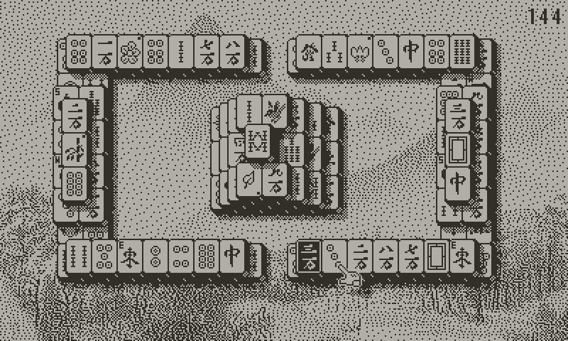
From here, I drew my own tiles in a pixel-perfect style. I kept the border and shadow of the tile as a separate image so that I could make changes to it without having to redraw every tile in the set. I learned that lesson pretty quickly! I could also change the size of the face patterns easily, by adjusting the canvas size of the sprite sheet using my favourite pixel editor Piskel. I narrowed in on the exact size of the tiles and faces, and they were stacking well on screen. A lot of time was spent perfecting the shape, edges and shadow of the tile to make stacks of tiles appear as beautiful, seamless and readable as possible.

Details that you may not notice, or that you may take for granted:
- the tile shadow makes a seamless pattern when tiles are stacked next to each other
- the white pattern in the bottom right corner of each tile remains partially visible when tiles are stacked, enabling you to quickly:
- count tiles
- gauge stack height
- judge tile offset
- tiles are an odd number of pixels high and wide, allowing face patterns to be centred
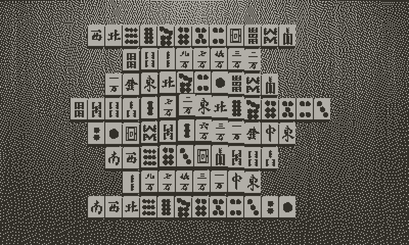
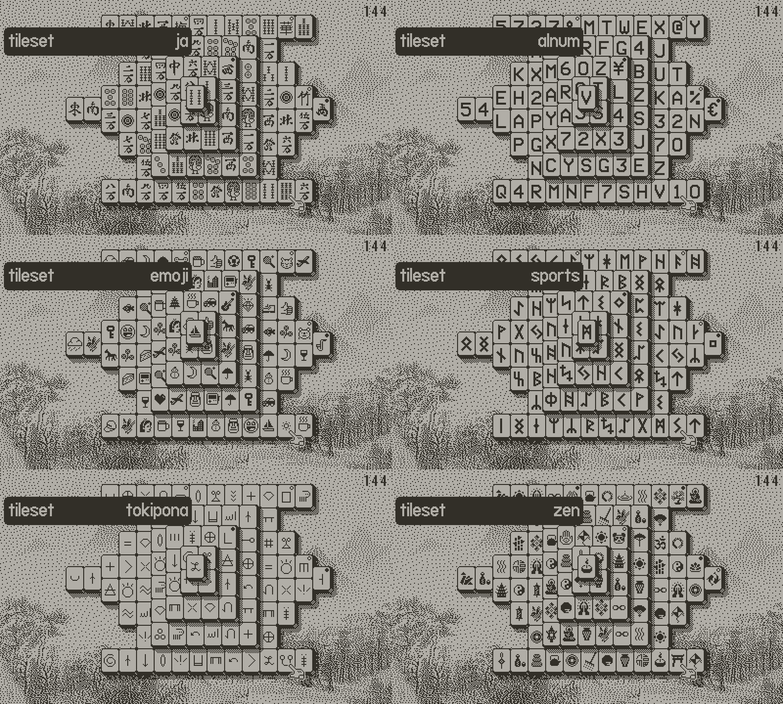
Traditional mahjong tiles comes in a few different regional varieties, so I created those alternates. It was at this point that I drew the sparrow tile and decided that would be the name of the game. I was keenly aware that the traditional symbols are foreign to most of the world, and can be somewhat intimidating to new players. To help with accessibility I drew some additional tile sets based on other symbols: Egyptian hieroglyphs, Toki Pona conlang, Alphanumericals and Emoji.
Alphanumericals are by far the easiest to use for native English-speaking players, but I personally find this tile set is lacking in charm. Emoji turned out to work best, in that it was very readable and also very familiar to most people given how familiar we are with emoji in our daily lives. The Emoji tile set has shapes that are all unique and the majority of them are bold and high contrast, especially when compared with some of the other sets.
The Unicode documentation is a great source of symbols and I used this as a reference guide in a number of the tile sets we have in the game.
Over time I figured out a recipe for designing a tile set that is easy to read and comfortable to play with. I’d imagine these rules apply to mahjong solitaire games on any platform, but they seem essential on a screen like the Playdate has.
- overall high contrast
- easily recognised symbols
- unique shapes
- consider shapes when tiles are partially obscured
- a good range of weights from light to dark
Drawing 42 symbols is a tough job. Finding that many of anything is tricky, but adding in the extra criteria makes things more so. The last ten or so tiles in a set are really hard work. The final stage of the process most often requires throwing away some symbols that are too similar, or lacking according to some other metric, with better ones needing to be drawn to achieve the required balance. The total number of symbols needing to be drawn will be close to double the required number!
Since drawing the emoji tile set I’ve put this technique into practice designing the following forthcoming tile sets: runic, sports and zen.

This is all work I think is worth doing - essential, perhaps - as players are going to be staring at tiles for the entirety of their time with the game. Tile sets will make or break a game like this.
— Matt Sephton @gingerbeardman
Get Sparrow Solitaire (Free Demo)
Sparrow Solitaire (Free Demo)
Elegant mahjong solitaire with a Playdate spin
| Status | Released |
| Authors | Vogelscript, gingerbeardman |
| Genre | Puzzle, Strategy |
| Tags | 1-bit, Isometric, mahjong, Playdate, Relaxing, Retro, solitaire, tiles |
| Languages | English |
| Accessibility | Configurable controls, High-contrast, Interactive tutorial |
More posts
- v1.1 Changelog: First (& last) big content updateApr 21, 2023
- Art & Graphics post-mortemApr 13, 2023
- Sparrow Solitaire v1.0Apr 11, 2023
- Entering the final stretchJan 31, 2023
- The perpetual quest for a perfect cursorAug 28, 2022
- v0.4 Changelog: More of Everything!Aug 04, 2022
- Sweating the detailsJul 24, 2022
- v0.3 ChangelogJul 18, 2022

Comments
Log in with itch.io to leave a comment.
It is like black and white. Great visual desigh! And this is manjong, this japanese title.
Thank you! Black and white (1-bit) is such fun to draw for. Like the original Macintosh.
We include Traditional Chinese mahjong tiles, and also Japanese, USA an European variations of the pattern. Plus new tile sets for players that are not so familiar with the traditional tiles.