Sweating the details
Below we briefly touch on some of our thought processes regarding the various elements of the game. Let us know if you’d like us to cover any of these in more detail!
Mahjong Tiles
The first task was to decide on a size that would allow a full layout to be displayed screen. I didn’t want the layout to scroll because you’d not be able to see all tiles at once. Though we have since added a crank-controlled @2x zoom mode for people who want to see the tiles bigger.
The size of tile also needed to allow me to draw the detailed mahjong symbols with enough clarity to discern the differences between similar symbols. — MS
Backgrounds
There are a number of background types in the game: sparrow-themed, landscapes, dots and night scenes. The dot images are generated using a special technique and all other images are classical paintings (16th to 19th century) dithered and redrawn in part or whole. — MS
Launch animation and transition
One of the unique features of Playdate and its system software is the way it can transition from launch card to your game intro. It makes sense to use this cool feature to make the simple task of launching the game as entertaining as possible.
I initially laid out a test animation with some draft assets and it looked good. I then redrew the assets to final quality, and during that process wondered if it was in my best interests to keep using aseprite or whether I should create the animation in code. That’s much more my thing so I couple of hours later I had an animation tool that I could use to position the bird and tweak the animation to my hearts content. I increased the length of the animation to allow for smoother movement, added more details to the movement of the branch (which wobbles as the bird jumps off) and made all the flowers move as if being blown by the wind.
The final touch was to decide how we could transition to the initial game state, and a fade in of the default image worked extremely well. If you’ve changed background settings, or are playing a different scene, we transition to that with a separate effect after our launch transition is complete. The animation tool will be released at a later date to allow other developers to create such detailed animations for use in their launch transition or in-game, and for anybody with an interest in animation to create on Playdate. — MS
Cursor modes
I’ve spent the most time in the development of Sparrow Solitaire thinking about the cursor (and fixing bugs with the cursor). After watching gameplay of many other mahjong solitaire console ports, I decided early on that I wanted our cursor modes to be a key differentiator. Console versions of the game have the disadvantage of lacking mouse input, and cursors controlled with a D-pad often feel slow and slightly cumbersome in comparison. So I set out to make the cursor in our version the best it could be, with a quick movement speed and intelligent snapping options.
The first cursor mode I worked on was the “free tiles only” mode, where the cursor only moves between tiles that are selectable. To accomplish this, I calculate each tile’s neighbor in the left, right, up, and down directions. The neighbor calculations get quite complex when you start accounting for the need to wrap to the other side of the layout and the fact that tiles are rarely perfectly aligned in the grid. I could write an entire post on how exactly these calculations work, but in short they had to be as optimized as possible since the all neighbors need to be computed every time a tile is added or removed from the grid. Fun fact: this is why using the “all tiles snap” cursor mode actually introduces a longer “processing” delay after removing two tiles, since there are more candidate tiles to snap to compared with the “free tiles only” mode. This is also why such cursor modes probably weren’t possible on early SNES/Gameboy versions of this game, as their CPU speed would have made the processing time unbearable.
It took a lot of tweaking to get these snap modes where they felt intuitive and comfortable to use, and even still they could use additional work in some situations. For this reason, I also decided to implement a “standard” grid cursor, where the cursor always moves 1-1 with the direction you are pressing on the d-pad. This mode gives you the most control, but still has intelligence baked in as after each cursor movement, I am checking for nearby top-most tiles to snap to. Without the neighbor computations, this mode is the fastest to process tiles, but not necessarily the fastest to move and select tiles. — MV
Cursor sounds
My goal with any game is to make the key mechanic enjoyable. Most of the gameplay in this game consists of moving the cursor and selecting tiles, and both those actions needed to feel satisfying on their own. For the cursor sounds, I had the idea of making them musical, inspired by the way Super Mario Maker plays notes in tune with the background music each time you place a block. I chose the marimba as my sample of choice, since mallet instruments reminded me of the clacking and ringing of the mahjong tiles. At first I tried playing a different note from a chord for each direction (left/right/up/down), and then complementing that chord with a major or minor third depending if the tiles selected were a match or not. This was fun to play around with but it almost felt like you were playing an instrument instead of a game! Since this could easily get distracting, I tried something more subtle instead (this original mode still exists in the music options as “cursor notes”).
My next approach was to use a mini marimba sample, as their attack is quicker and there’s a lot less reverb. The cursor samples consist of three notes, D, G, and A, spread out over three octaves. These notes best match the chords in the title theme Herbal Remedies, and the note that plays is determined by the current layer of the stack the cursor is on. In addition, a high D5 plays when the cursor is held down and moving faster. The cursor sounds wouldn’t be complete without chimes for correct and incorrect matches, and I wanted to keep those chimes both simple and satisfying. I used short marimba flourishes for each. — MV
Sounds
Sound can often be overlooked, with the a single sound over used to the point of annoyance. I wanted to avoid that outcome, so spent a lot of time sampling mahjong tile sounds to make every deal layout sound unique. Tiles that are dealt to the table have one sound, tiles that are dealt next to other tiles have another, and tiles that are dealt on top of other tiles sound different again. These sounds are also played back with a small random change in speed to make them feel even more natural. — MS
Fonts
The majority of the fonts I have created for Playdate are sans-serif (like Helvetica, Arial) or slab-serif fonts (like DIN, Courier, Roboto). These all looked too modern, bold and out of place in Sparrow. We looked around to find alternatives and almost settled on Argent Pixel CF (a fantastic pixel font by Connary Fagen based on his typeface of the same name) until we realised that we would need a condensed font to get everything to fit on the stats screen. I looked around for inspiration and settled on drawing my own upright-italic along the lines of Stern, Cormorant, etc. ps: the web-based tophat is my font editor of choice. — MS
Music
I often spend time looking for new, royalty free music with no specific game in mind. Just collecting tunes that I can refer to every time I make a new game. I feel it’s important to get a vibe and the music is essential in this. One day shortly after starting the prototype of Sparrow I heard a tune that I thought was really catchy and could be suited to the game. Then the sound of birds rang out as part of the tune! It was meant to be. After the game launched I contacted the musician to let them know that their music is featured in the game — they were surprised to hear this! Although their music is royalty free, they hope to have a Bandcamp ready that we can share for donations when the full game launches. For now, the Soundcloud playlist can be found here. — MS
Options
Seriously, who writes a devlog about an options menu? I want to highlight it because it was important for us to have many customizability and accessibility settings in the game. Mahjong solitaire has been around for a long time and has gone through multiple iterations and ports, and a variety of play styles and preferences have developed as part of that. We wanted to easily be able to expand and configure almost every aspect of the game, all of which is facilitated by our options class. Matt originally ported it over from Daily Driver, and I took it from being a debug menu to something more flexible and extensible for a finished game. The class supports headings, toggles, and list selection, and per-option dirty tracking to support efficient live changes. With the full release of Sparrow Solitaire, we will open source this class to encourage more developers to have this level of customizability in their projects. — MV
Statistics
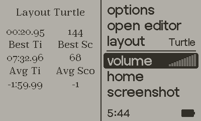
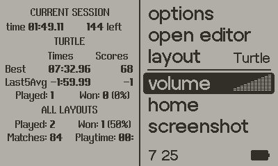
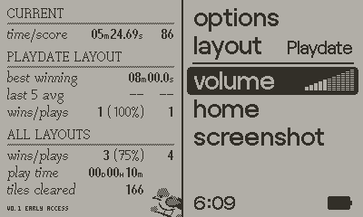
PC solitaire games have historically had an emphasis on statistics and play logs, and we wanted this one to be no exception. As the current build lacks a level select menu, it took us a couple days to figure out how to elegantly fit the stats we wanted within the 200x240 bounds of the pause menu. One unusual element about this game is that we only track best score (tiles remaining) while you haven’t beaten a layout, and switch to tracking best time after you have. The logic for this is simple, but figuring out how to display both times and scores in an easy-to-understand and small stats screen took some time. The extra space provided by a full level-select UI will help a lot in the full game, and allow us to add additional features like a history log of all your games. — MV
Below: the progression of the stats screen


Get Sparrow Solitaire (Free Demo)
Sparrow Solitaire (Free Demo)
Elegant mahjong solitaire with a Playdate spin
| Status | Released |
| Authors | Vogelscript, gingerbeardman |
| Genre | Puzzle, Strategy |
| Tags | 1-bit, Isometric, mahjong, Playdate, Relaxing, Retro, solitaire, tiles |
| Languages | English |
| Accessibility | Configurable controls, High-contrast, Interactive tutorial |
More posts
- v1.1 Changelog: First (& last) big content updateApr 21, 2023
- Art & Graphics post-mortemApr 13, 2023
- Sparrow Solitaire v1.0Apr 11, 2023
- Entering the final stretchJan 31, 2023
- The perpetual quest for a perfect cursorAug 28, 2022
- v0.4 Changelog: More of Everything!Aug 04, 2022
- The art of designing tile setsJul 31, 2022
- v0.3 ChangelogJul 18, 2022

Comments
Log in with itch.io to leave a comment.
Great read! Fascinating how deceptively simple the development of this kind of game can seem at first glance, and yet so much is going on under the hood; like a case study on Steve Jobs principles on good UI, which is invisible to the user.
Many valuable lessons, notably how sounds play into the theme, and your focus on effective use of screen estate.
And thanks for sharing your prefered font editing tool and the Argent pixel font. I developed a passion for pixel fonts since I discovered the work of Susan Kare on the Macintosh system. This will come in handy I’m sure.
Thanks for the kind words! It is deceptive when you look at this game, or any game really. We could have taken a few shortcuts to do things the way they were done at the time of the Game Boy, NES, SNES but we really wanted to take advantage of the Playdate hardware. So we pushed to do more, making it more complicated in the process.
Argent font would have required licensing for app/game use, so we used the personal version for a while until we realised we couldn’t fit what we needed on screen. Would have been great to use it, and thankful we did not pay and then realise it was not right for us. Phew!
Yes I love that you’re looking at the Playdate as a legit modern gaming platform. I’m afraid to see it stuck in the 8-bit arcade clones and gimmick games . The flip side of the black and white screen and the form factor is that I’m not sure that it’s taken as seriously as it should. It deserves its own generation of future classics, like Civilization, Prince of Persia, or Lemmings were when they came out. And I’m not talking just graphics and sound but meaty content, long lasting value and polished game mechanics. Anyway, Sparrow Solitaire ticks all the right boxes to me :) I hope it will encourage others to push the envelope.